Friday, June 11, 2010

My List of Inspirations

1. Bright, Vivid colors
2. Songs that get me into a certain mood - Classical, Jazz, Oldies and some newer stuff
3. Victorian things
4. Audrey Hepburn or Vivien Leigh photos
5. Dramatic Clouds
6. The hour of midnight
7. A feel good movie (classics always get me in the mood to be creative for some reason, lol)
8. Art Galleries
9. Museums
10. Documentaries on the creative process
11. Looking through old photos
12. Looking at my past art work
13. Hearing others ideas
14. Reading about Love Stories
15. Certain times of day, esp. early morning I love and late and night (wish I could have the best of both worlds)
16. Certain good memories and good times
17. Outdoors, esp. at my Grandma's property and being at her house.
18. Antique shows
19. My niece
20. Visiting new places

The Inspiration That Makes or Breaks An Artist


Inspiration is such a fleeting moment. You can have it one moment, and yet it can be entirely gone by the time you're ready to plop yourself down and actually accomplish that wonderful idea you had. Why does this happen and why does inspiration become such a driving force behind any art, whether it be music, drawing, writing, etc?

I think what it is, is that to be in the arts, you truly need a certain amount of "mental" space to actually churn out this thing we call inspiration. John Denver is a wonderful example of inspiration motivating most of his work.

When he went to Colorado or West Virginia, his inspiration ran high. I think what causes certain inspirations are when we're in our most pensive state. It's hard to become inspired when you're constantly on the go, without really setting aside "real" time to inspire yourself to do something out of the ordinary.

I know my inspiration levels have dropped so low because my mind has become so crowded with so many things. If I only had just a few weeks of no work, no money woes and no health woes, I think my inspiration would be at an all time high and I'd accomplish SO much! Now, just thinking of pulling out my oil paints begins to feel like pure drudgery for me and all I want to do when I get home is eat and sleep or go on the computer.

Ahh, yes, the computer - my little half devil, half angel. I mean this because the computer can make one accomplish many, many things - paying bills, writing friends and keeping in touch at lightening speed, making new connections and being able to find anything and everything I ever wanted to know about anything ever before. Yet, before I had a computer, my life just seemed a little less complicated. I would write people letters by hand, I'd personalize them and make them special. I'd make more art and use my creativity. I'd challenge my brain to draw and paint, rather than use a mouse to do such a thing. My inspiration, again, was at an all time high. Yet, I didn't have a job, I was homeschooled and I had hours upon hours to pretty much daydream my life away. I'd write stories or think up new ones. It was all a fantasy world I was living in, but it was fun and creative and my mind seemed so free and full of so much potential. I had so many less worries.

Yes, inspiration is hard to come by when money is a driving force. Yet, I am determined to continue on working on my inspiration and to not let it go. From now on, I will follow through. It's like exercising for the brain. You need it to keep you going and to live. If not, our brain will lose any remnance of that child we once were inside at one point in time. We need it to thrive and to grow. It's important.

Just as important as a running stream or the rustling winds. It's relaxing. Inspiration moves us in directions we never thought we'd go.

Let's keep it going.

Friday, May 14, 2010

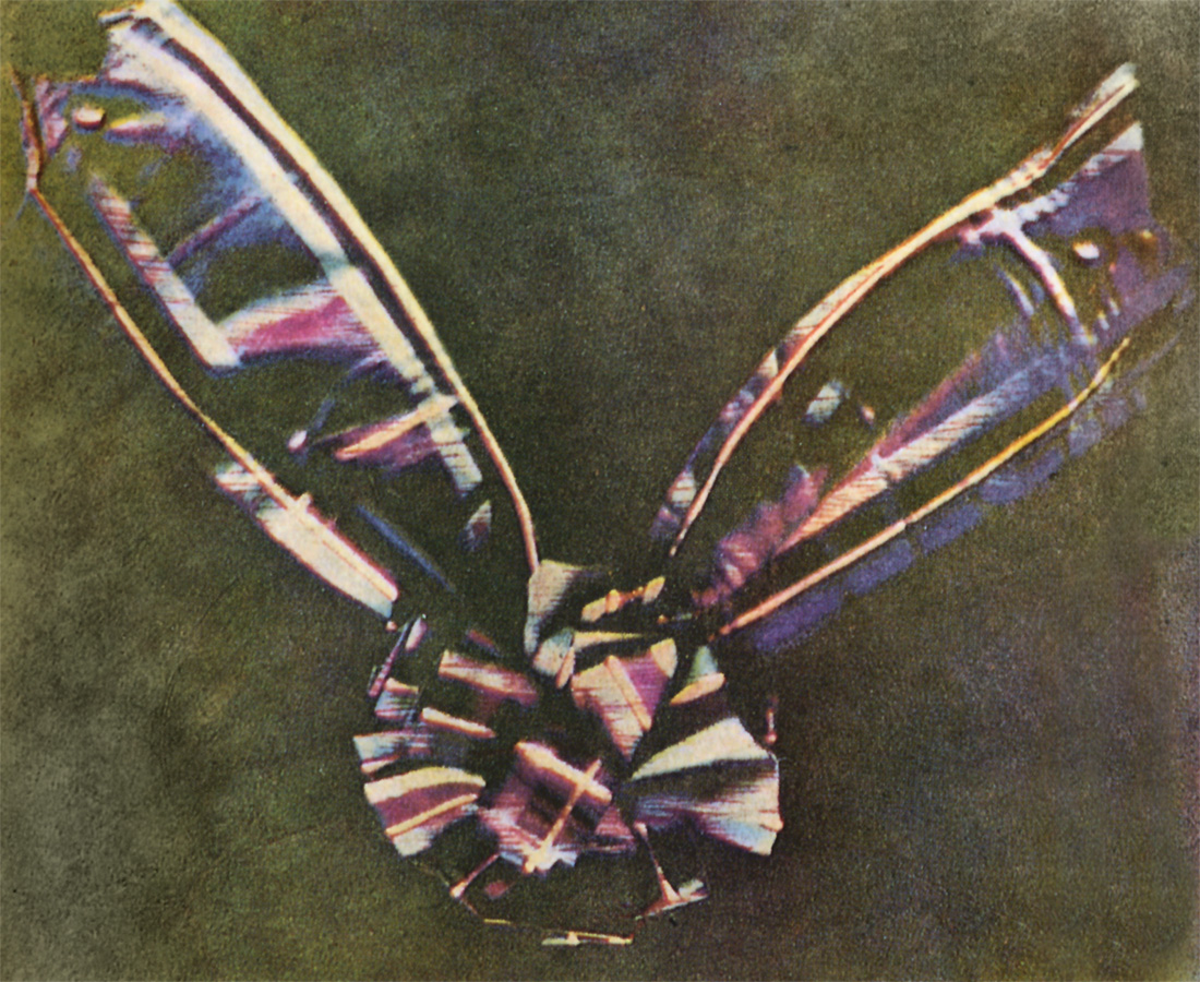
Color Photography Before It Was Mainstream


(Photo taken in 1877)

I find it really interesting to find photos taken prior to 1950 that were in pure color, as they just weren't very common, especially for middle class Americans or even upper middle class Americans, at that. It was still quite a novelty and not very cheap.

Here are a few amazing pictures prior to what became Kodachrome:

The first known color photograph from (gasp!) 1861. It shows ribbon from a tartan.


The following pictures were taken by Sergey Prokudin-Gorsky from the early 1900s.


When Kodak came around, they began to make a mainstream 35mm and Slide film called Kodachrome, which became popular amongst amateaurs and professionals alike. It was still pricey for the time, but for those who got to use it saw color in a whole new way. It was as if Technicolor had reached inside their camera and taken it over. Please see some beautiful images using Kodachrome film from the 1930s to 1940s:


Well, lets just say color photography has not been the same since.
These timeless early color images will tell a story for generations to come.

"Kodachrome" by Paul Simon (1973)

They give us those nice bright colors
They give us the greens of summers
Makes you think all the world's a sunny day, Oh yeah
I got a Nikon camera
I love to take a photograph
So mama don't take my Kodachrome away

---------------------------------

Sadly, due to the lack of interest by most of today's digital camera consumers,
Kodak discontinued Kodachrome film in 2009.

Friday, April 30, 2010

What style of Photography Do I Identify With?

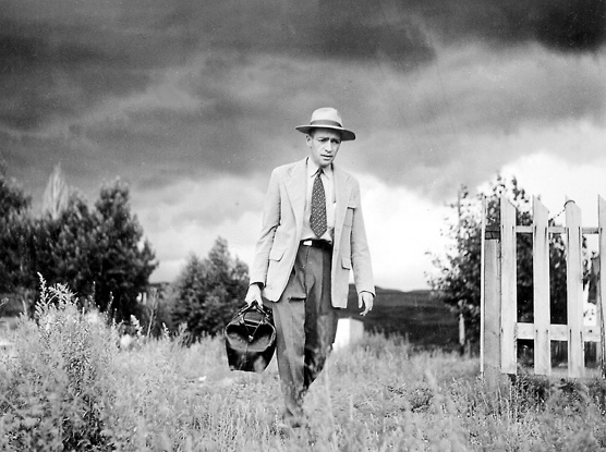
My leanings with photography are just as varied as they are with different artistic styles, as well. I love so many different eras throughout art history, that it's difficult to pinpoint my exact favorite. Yet, learning and defining my style has been difficult over the years. I know I have a "look" to how I photograph things, but I couldn't quite find another photographer who leaned towards that look that I was also trying to achieve. Then, one night, my teacher introduced me to a photographer named W. Eugene Smith. A very tormented, even a little crazy at times, photographer, in search of "truth." His photos immediately spoke to me. His torment to get the best picture in the most authentic way also spoke to me.

His images reminded me a bit of how one of my favorite artists, Edward Hopper, painted his images of very American scenes that were just ordinary scenes of daily life.

Here's a sampling of Hopper's work:


Here's a sampling of W. Eugene Smith's work:


If you'd like to learn more about these two great artists, please check them out on the web or in books. They are definitely an inspiration.

Wednesday, April 28, 2010

Sunday, March 28, 2010

Renaissance Lady


IMG_9814
Originally uploaded by Kristen Loftin

Girl chasing Balloon


IMG_9811
Originally uploaded by Kristen Loftin

Woodblock Print


IMG_9812
Originally uploaded by Kristen Loftin
2nd View

Drawings in Pen & Ink


IMG_9813
Originally uploaded by Kristen Loftin
In my drawing course this semester, we are drawing in pen & ink. For fun, I found these adorable woodblock prints that seemed to use lines in a very similar way that drawing in ink allows. These woodblock prints are from the late 1910's, early 1920's - so this is why the children have these bobbed hairstyles. I will try to draw more.

I also attempted to draw a more renaissance style portrait, but my hand was growing tired, so I lost a little enthusiasm for this one, and may have to add more ink to it later. Ink can be painful because there is no erasing. Once you've made your mark, it's there for good! This is both a challenge and a thrill at the same time. It can test your patience as an artist. I feel like, despite how difficult it can be, ink is by far one of the most enticing styles for artists to continue in. It's a good mastering of your skills and keeping yourself in line (no pun intended.)

See additional images above (I am using Flickr.com to post from and use my photos, so this is a new process for me and am still not sure if I like this style. May try it differently in the future.)

Sunday, January 31, 2010

Old Sketchbook

I ran across a sketchbook I used to keep at the Newspaper when times would get slow; I could then draw in it. Doesn't sound productive for my employer, but Newspaper call centers are obviously hurting for business lately, lol.

Some of the earlier drawings were from way before I started working there, sometime near 2001.

Please enjoy!

San Francisco - A little Piece of My Heart

What can I say about San Francisco - The sourdough smell you get in the foggy air? The strains of the Golden Gate bridge while crossing that other great structure, the Bay Bridge (which is actually older than the Golden Gate)? The diversity of the people, food and culture?

Well, I've been lucky to live very close to San Francisco my whole life. I never went to the city too often when real young. Only the big adults would be able to go, and it usually was for legal stuff. Not until I was about 10 years old did my class go on a field trip to Pier 39 to take a fleet that went under the Golden Gate and passed Alcatraz (the Rock.) I LOVED this place. I couldn't wait to return again someday soon. My visits would be sporadic after that, but the more I got to go, the better each visit became. Trips to the Cow Palace for antique shows. Visting the Butterfield & Butterfield antique warehouse. Having dinners at sunset over Ocean Beach at the Beach Chalet. Looking at the Camera Obscura at Cliff House. Looking over the remains of the Sutro baths. Visiting the SOMA, Palace of Fine Arts and Legion of Honor.

Eventually, my brother met a girl who lived in the city. They married and lived off of Vallejo street (near Coit Tower) for about a year and a half. I visited a few times and got to familiarize myself with that area. I took pictures and saw a picture last night that inspired me to paint/draw it with pastels.

Here is the result:


It's not my absolute best. But, it's a start for what I call a long time since I've drawn perspective. This scene would capture where the Montgomery Steps are.

I might start a San Francisco series of paintings/drawings to inspire me to do more. I have tons of pictures of San Francisco I've taken which I can draw from.

Let's see how my progress works out :0)

Saturday, November 7, 2009

Mary Blair and her Influence on My Style


Mary Blair's style, in retrospect, is like a 20th century version of John Singer Sargent. Her colors are vibrant, balanced, innovative, and full of whimsy.

Her illustrations and work are constantly on my mind because she illustrated in a way back in the 30's and 40's that many people did not. It was a very modern approach that I think she was often copied for.

Her biggest claim to fame to this day is her brilliantly colorful "it's a small world," exhibit that is at Disneyland (originally it was at the Worlds Fair in New York in 1964 before Walt Disney transplanted it to Disneyland.) She was no stranger to Disney, though.

She designed many artboards and story boards for his big time animated films, such as Alice in Wonderland, Peter Pan and animated shorts. Many of her design concepts were used for the films.

Mary Blair will always be a source of inspiration for my art work and will always strive to maybe some day be just as innovative in my own style :0)

Thursday, June 11, 2009

Some Gallery Owner Advice

This website may assist in one's quest to get commercial recognition. Please check out for some encouraging viewpoints!

http://www.artbistro.com/news/articles/8862-how-to-get-commercial-gallery-representation?utm_source=nlet&utm_content=ab_r3_20090506_ugal

Making it Big

I have been in one art show. It was a lot of work and I only exhibited one piece. This art show occurred about 8 years ago, about this time of year. I thought it was a great opportunity for me because I could get recognized and also attempt to sell the work I was going to exhibit. I was just barely 19 years old, never been formally trained and scared to death of the competition. Yet, I also felt confident in my work. I remember this painting being a labor of love because I felt if I do win something, I will have put my all into it. Probably most people who enter their work are feeling as if they've got their heart on their sleeve. It's a very difficult process because you really are stripping yourself to an emotional core and hope people admire your work. You can't help but watch people take a peak at it and wonder what they're thinking. "Ugh, you call this art?" or "Wow, this is very well done." You almost feel like a stalker, like you see people examining your work and you want to watch, but you have no entitlement to go up there and try and "sell" it to them, you just have to wait and see! The torture!

This piece I worked on was a scene of the Doges Palace in Venice. Yes, a pretty ordinary scene, but I loved the sunset in the background and thought it would be a good show piece. Maybe not some kind of eye poppping kind of work, but for me, I put every ounce of my love into it. Moreso, the finish I put on the frame was also a labor of love. The frame was originally a blue color and I used acrylic paints to white wash it. Then I added some kind of varnish, sanded it down, dried it, did all kinds of things to it. I think I almost admired the frame more than the painting! Yikes!

So, here came the big day! I was very nervous, as I am generally shy, so setting things up and sitting and waiting and standing and waiting and mingling with strangers was unsettling on my nerves. But, I tried my best to put a brave face on. I had some family come and support me. The local newspaper took some pictures of me. People had snacks and drinks. A local jazz band played for us. It was actually, not very nerve wracking after all. Yet, when time came to announce the winners, my heart went into overload and raced with trepidation. I kept telling myself, "I am good enough to win, but I am not as good as some of these other artists and there are so many I'm up against - but, I am good enough."

Well, they announced, one by one, 1st, 2nd, 3rd, Honorable Mentions and then it was done. Nope, not one single piece of recognition. My heart then felt afflamed. I looked at the other art works feeling a little jaded and a bit let down. I then looked at my art work critically. Part of me wanted to take my work down and run with it in shame. I just felt maybe I am too thin skinned for this kind of thing.

Well, the show went on. People had their congratulations and now it was the time where patrons could come in and actually purchase work. I stuck around, but still felt a little down. I still kept my happy face on and tried to hang in there. Then when I was across the room, some of my family noticed two men taking a serious look at my work. Then the two men went around the whole show and evaluated the works. Then the men came back to mine. It was a strange feeling. I watched them - should I dare say it - admire it!

Some time passed and those same two men returned. They then made a deal with the people in charge of the art show. The men left. I ran (or just walked quickly) over to my painting to find a "Sold" sign on it! I couldn't believe it! This was a huge reward for me. Better than 1st place!

As the show wrapped up, I gave my painting a once over and said good bye to it. If those men only knew what I put into it and the history behind it, they'll hopefully enjoy this work just as much as I did. My family and friends noticed that only two other paintings sold besides mine. I felt that maybe this show was worth it afterall.

Wednesday, May 27, 2009

Artistic Inspirations


I think from an early age, many things captured me in a magical way. Probably some of my earliest inspirations were from watching the old Disney cartoons. The colors in them were so vibrant, especially the ones in the Silly Symphonies or the Jiminy Cricket Specials. They had such an enduring quality, that I think from that point on, they became my gold standard of how art should look. Here are a few examples of what I am speaking of:


As you can see, Disney had some amazing artists. The background artistry is just eye popping and very much outdoes the actual animation. I think Walt Disney had such high standards and also, it just goes to show that this kind of animation is a sign of the times. It's style is not longer in favor today, even though it can still be appreciated. Pixar comes pretty close, but still not as close and as lush as this.


I think the thing with digital art is that it's trying too hard to look too real. It doesn't want us to believe that they're actually fake. It's still eye popping and tediously done work, but it just beats to a different drum.


As I got older, different styles grabbed my attention. Books I read that were illustrated often demonstrated that same rich color effect that I still find attractive until this very day. One book I've held close to my heart which may not be familiar at all to anyone out there, but it was called, "Martha's House," where Martha, a little girl, took you through her house and showed you each room, sometimes some goofy things were happening, but all in all, it looked like an ideal place for a little girl to grow up. I may have just wanted to jump in there and be a part of it. I still have it somewhere and just grin, ear to ear, when I sit myself down and read it. I feel like I've stepped back in time.


Other books that had beautiful illustrations that captured me were the Original Mother Goose Book, full of illustrations from the 1910's. All the kids looked like little cherubs, but they were beautiful images, each and every one.


A few other books were the Disney books that had their movies in full illustration mode. The colors were just as vibrant as they were in the movie. The Lady and the Tramp one I especially liked and would look it over and over.

As I got into my teens, I began a fascination with old movie stars. This time, all color was diminished, and this time I think what I was attracted to more was the mood and style, rather than anything else. Even the contour of things is what stood out. I would draw countless old movie stars and began a large appreciation for many, including:


Vivien Leigh - Ever since watching Gone with the Wind when I was about 7 years old, Vivien Leigh's beauty has been, to me, a trademark. I didn't see her in another movie until years later, in which I believe was A Streetcar Named Desire. She had aged, but her acting was mesmerizing. I had to see her in more films, and I did. I ultimately became a collector of her memorabilia and actually have quite a collection - including an autographed photo of her.


John Barrymore - Always the one with the great side view, John Barrymore has a look that can often be hard to capture but can also be attainable if you practice it several times over.


Errol Flynn - He's got the looks of your all around good looking movie star. Yet, he has an impeccable side view.


Ava Gardner - After reading about her over the years and even visiting a museum devoted to her in rural North Carolina, Ava Gardner's wit, no holds barred attitude, and beauty have had me under a spell. I read a biography about her about a year ago, and it was almost impossible to put down. Things she did were really stranger than fiction, but fascinating and jaw dropping! Drawing her is almost impossible, but I have had a few semi-successful attempts.

Audrey Hepburn - Audrey is like the creme De la creme of ultimate beauty in Classic Hollywood. It's almost impossible to capture her at times because her looks are so refined, yet so unique. You want to capture her large eyes, full lips, high cheek bones - but somehow you can miss the mark - and badly! I think this is why she enchants me because she isn't cookie cutter beautiful and each time I see her, in books or on screen, I just want to try so hard to capture that unique look in a drawing. I am sure she's tortured other artists as well!

Monday, May 25, 2009

Gallery of Art


Here are some scans I made today of my artwork between mainly 1998-2000. I was my most prolific at this time in my life because I didn't have a job, bills to pay and a big social life. I miss those days!


Edgar Degas as an Inspiration


Many girls, I am sure, have been fascinated by the Edgar Degas' artwork in which he has captured ballerinas. They are probably his most enduring works to date. I remember first getting a glimpse of them and loving how he seemed to capture the moment, just like as if he was taking a photograph at any random moment. It didn't feel rigid and posed. One of my favorites of his is captured above. I did this one myself, but I still feel as if his is by far the superior one.


A lot of Edgar Degas work was done in pastel and I think his work inspired me to be more conscious of the effects of pastel. I am speaking of oil pastels, but some of the more chalky kind of pastels can still ellude a similar effect. The neat thing with oil pastels is that they give a similar effect that oil paints capture. Oil seems to give a lot of depth to images. This may be why I prefer to work with oils more and more.


Not long before I started using pastels, did I only have access to watercolors. I think as children we mostly exposed to crayons and watercolors. Watercolors are easy as a child because they are easy to clean up after, use mostly primary colors, are fairly cheap and fun. But, if you want to paint in watercolor and be good at it, that's another story!


Watercolors were very difficult for me to grasp. But, since I only had those and pastels to work with, I had to sort of teach myself techniques in which to grasp them. Keep them restrained and not runny. I wanted rich, deep colors from watercolors, but they'd always turn out flat and lifeless. By the time I turned about 17 or 18, did I finally figure out how to get them right. Please look at the following examples:


As you can see, I really tried to make them have some depth. Again, this was self taught. I was about 16 when I did the one on the left and about 18 when I did the one on the right.
When I first discovered John Singer Sargent's work, it was maily my admiration for his excellent skill in watercolor. Till this day I cannot find myself admiring anyone else more than him. He was precise and exact, yet free flowing. The picture on the right demonstrates me trying to copy a John Singer Sargent painting.
Learning various techniques helped me grasp the idea that water colors can be vibrant and have depth, but just not in the same way as oil paints.